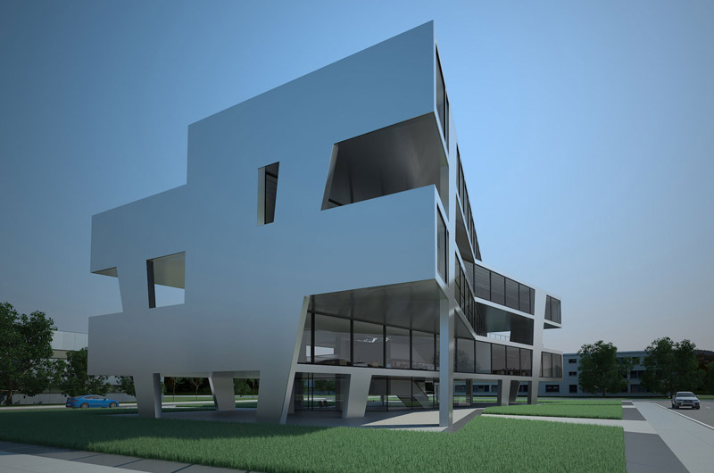
German architects Wurm + Wurm have managed to take a simple concept an execute it beautifully: office buildings are typically designed one boxy floor atop another, but nobody ever said the boxes have to be perfectly aligned. Such is the case with this design, an office building for Goepel Electronic in Jena, Germany. From most angles the building appears lofty and daring, yet when viewed on its narrow axis, perspective becomes distorted and the building appears appealingly silhouette-like.
© 2023 Arccentric - all rights reserved.
Important Note: It appears you are using an older browser to view this site! This site utilizes modern web technologies that do not display correctly within outdated browsers, such as Internet Explorer 8 and below. Please consider upgrading to a more current browser, such as Internet Explorer 9, Chrome, Firefox, or Safari. We promise the internet will love you in return.